role: strategy, concept, design, copy
category: institutional, agency
year: 2014
category: institutional, agency
year: 2014
context
Contemporary architecture often speaks with a “foreign voice”—the polished, instant language of social media. That voice demands perfection at all times, but the real process is defined by revisions, site dust, and constant change. When a studio forces this messy reality into a smooth feed, the identity starts to deform. It loses its character by trying to look like everyone else.
concept
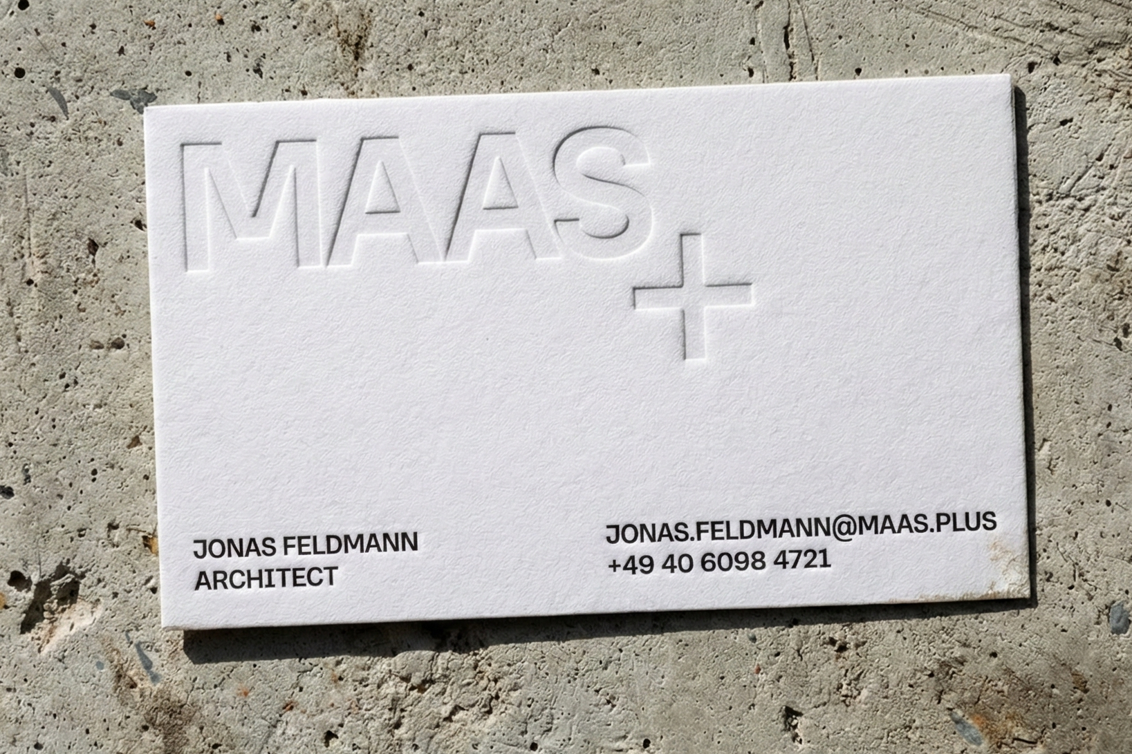
The brand was reframed from a visual representation of "creativity" to a numerical infrastructure. Drawing on Pythagorean principles, the identity utilizes the "Number Eight" as a discrete, rigid foundation—the only constant in a changing world. By adopting the "water-like" logic of Andrei Tarkovsky’s Solaris, the concept proves that identity is preserved through change by form, not matter. The brand is not the "ink," but the "logic of the drops".
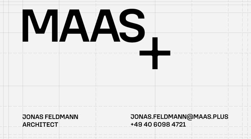
Business Card Layout / Gravitational Grid. Elements are positioned by gravitational pull within a dual modular system.
system logic
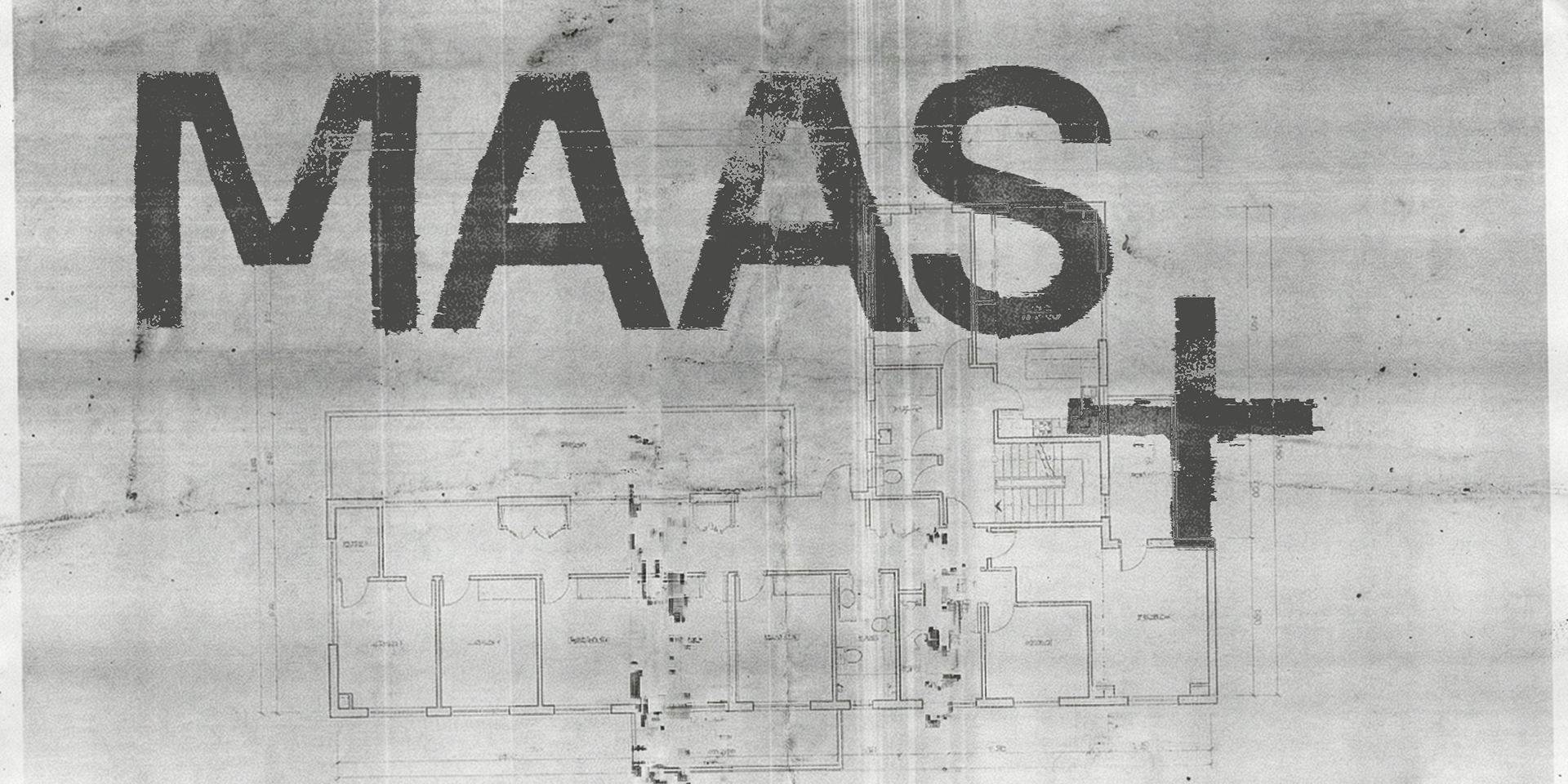
MAAS+ resolves this tension not by hiding the mess, but by anchoring it. The identity acts as a “Tolerance Architecture”: it assumes content will shift, degrade, and vary across documents, scans, and site images. To hold this variability, I introduced a fixed Anchor—a rigid reference that stays the same wherever it appears. The Field can move; the Anchor cannot.
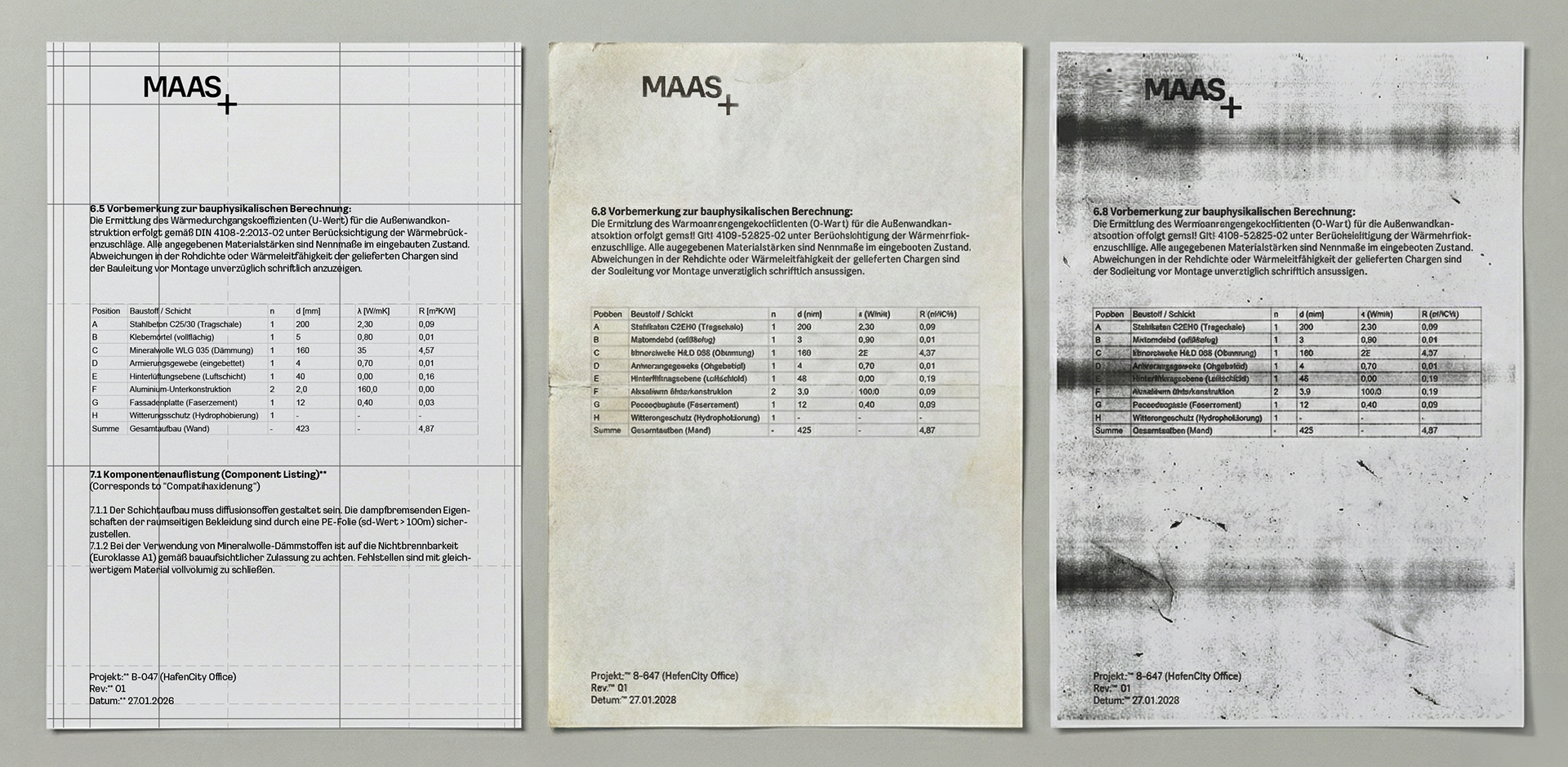
Material Degradation and System Resistance
The sequence demonstrates progressive visual degradation under real production conditions. Left: the initial state — a calibrated layout defined by force lines. Center and right: successive stages of material wear, reproduction loss, and surface contamination. Content gradually collapses into a filter. The system does not prevent degradation — it resists it by maintaining orientation.
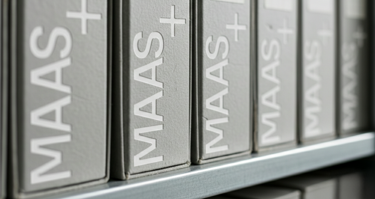
The identity enters the system at the level of use — storage, handling, repetition.
The primary condition of the office is not creativity, but drift: low signals, exhausted attention, repetitive tasks, and environmental boredom. In this context, a logo cannot function as a decorative image; it must function as a specification tool.
The system accepts change, noise and reproduction as normal conditions, while a single fixed Anchor keeps the system coherent.
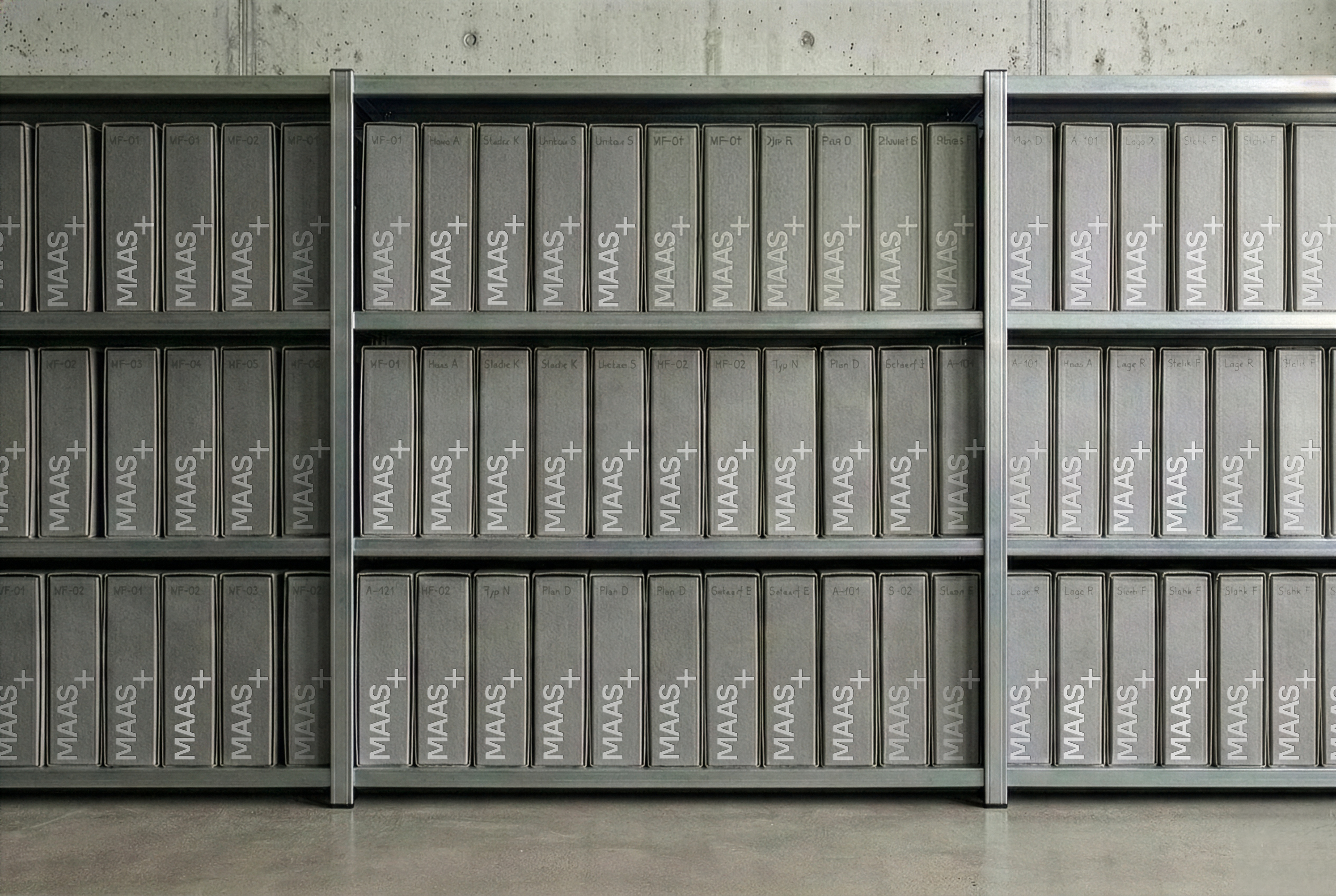
Archive after 2 years of continuous use. Early wear within controlled tolerance.
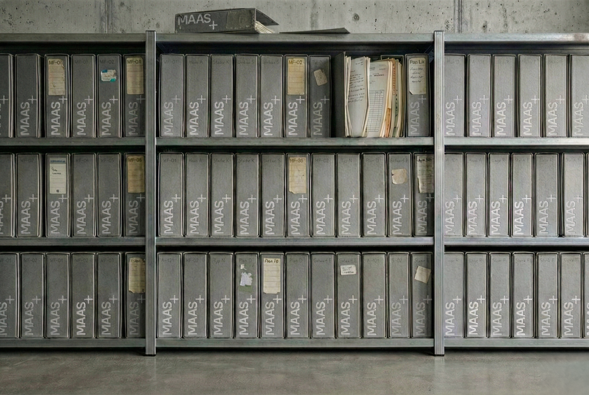
Archive after 20 years of continuous use. Advanced wear. System integrity preserved.
value
By refusing to imitate the platform’s smooth aesthetic, the studio regains its own voice. The identity validates the real conditions of construction instead of masking them. It stands out in the feed precisely because it stops trying to fit in. The result feels clear, professional, and process-native—and stays easy to apply without constant “taste decisions.”
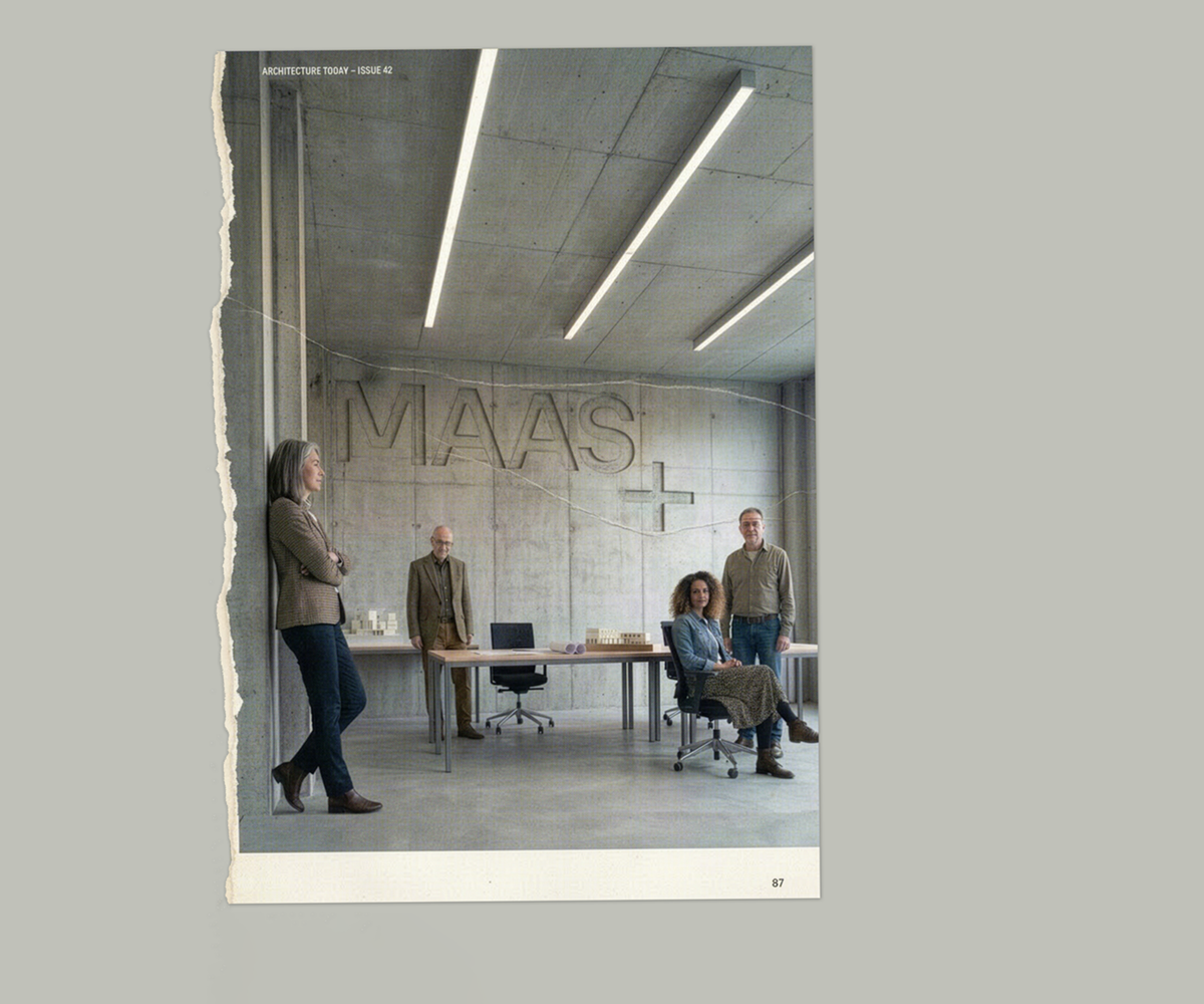
The system remains alive and adaptive: elements shift, expand, and transform into containers for images, textures, or messages. Together, these specialized forces form a coherent network, where diversity is not ornamental but functional — the engine of innovation within a single organism.