role: strategy, concept, art direction, design
category: real estate branding
year: 2013
category: real estate branding
year: 2013

context
Finch was a boutique operator of rare high-end properties. It depended on trust, recommendation, and private recognition rather than public visibility. Clients did not search for Finch in the market. They arrived through recommendation. A standard identity system would have made the business too explicit and too available. In this segment, that lowers value.

concept
The name itself became the fixed point of the brand. It also provided its recurring figure: the finch. Instead of building a visible identity, the strategy was to let the brand appear selectively through objects, printed matter, and private events. The absence of a permanent visual system was not a gap. It was the correct form of control.
system logic
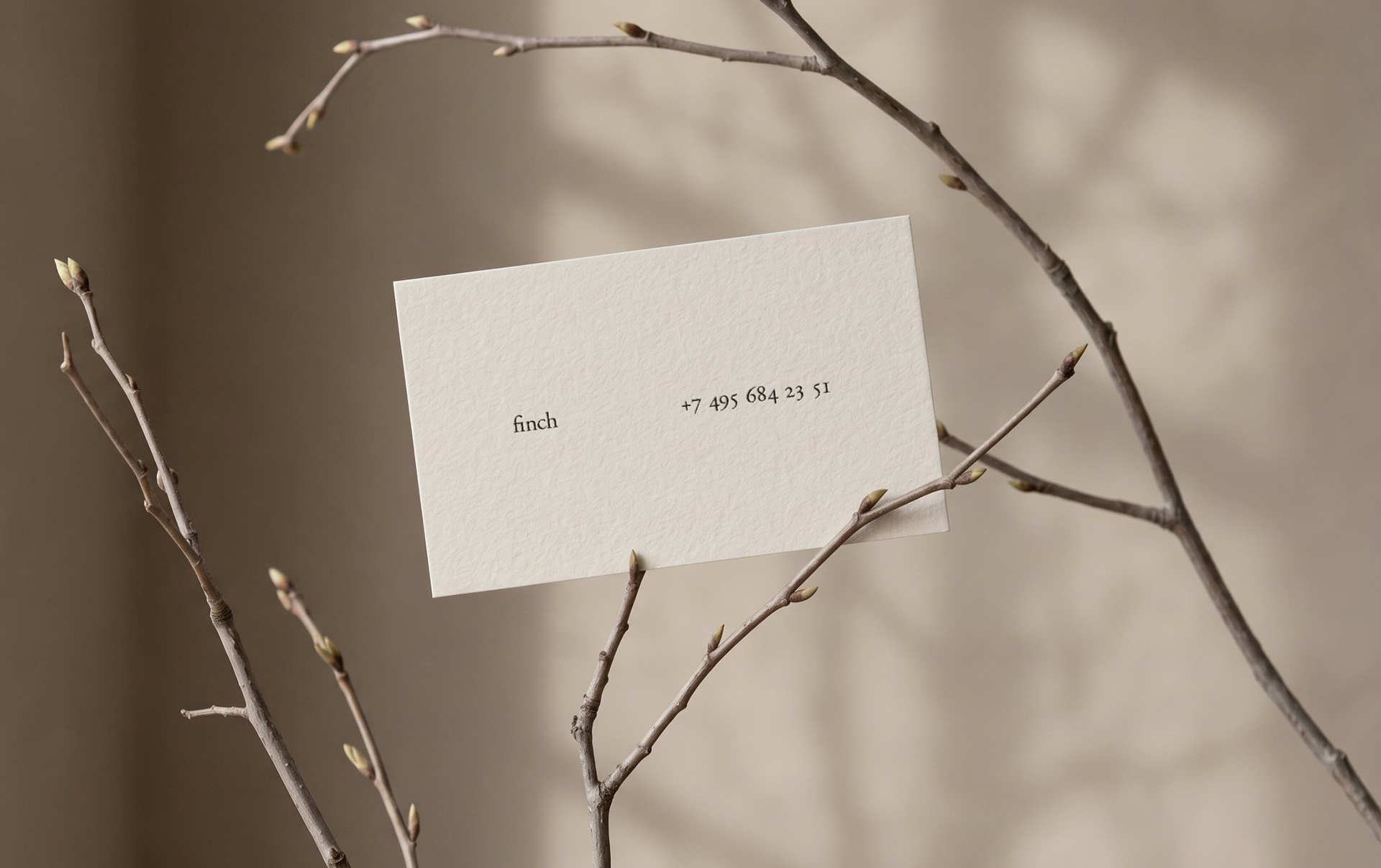
The brand appeared only when there was a reason for appearance: as a private event, a client gift, or a cultural object. One of these formats was the pop-up exhibition, where Finch temporarily operated as a gallery inside the properties it was offering. In that setting, the brand existed through framing, selection, and presence rather than through a louder visual layer.
Finch did not need a public-facing identity. In this market, the name had to carry recognition on its own, while the brand appeared only in private and only for a reason.
set 1
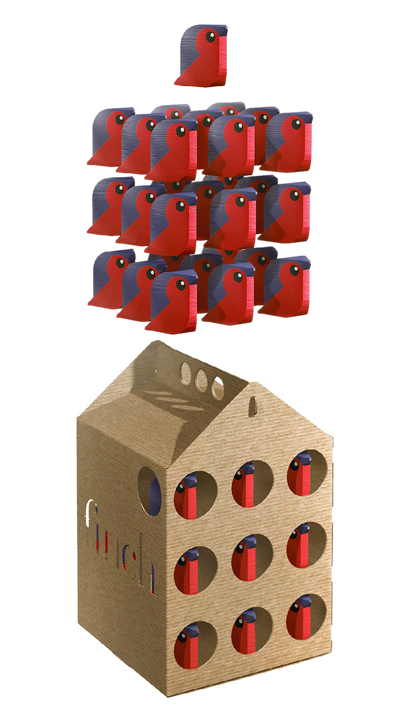
The same rule shaped the gift set. A house-shaped box in micro-corrugated cardboard contained a flock of Christmas tree toys in the form of finches. Construction, function, and image were merged into one object. It did not illustrate the brand. It gave the name physical form.
set 2
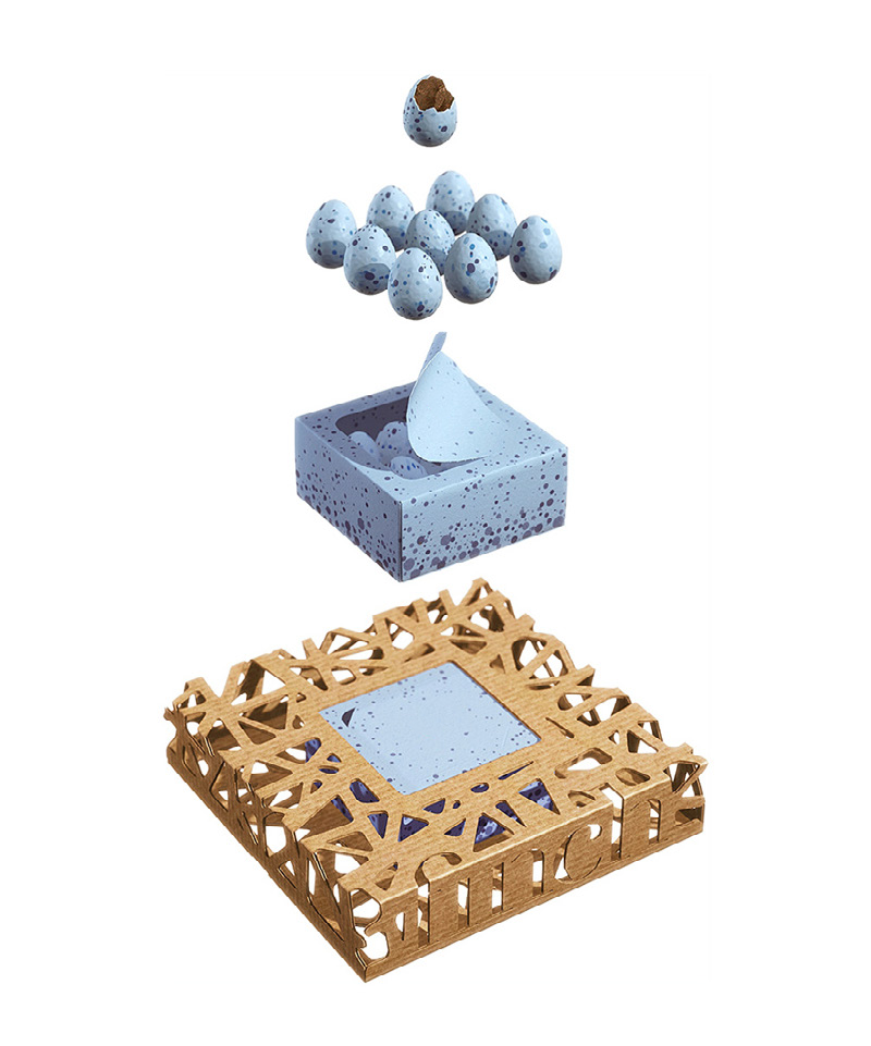
A second client gift used a custom nest-shaped package for a specially produced set of Swiss chocolate eggs. It combined a delicate inner box in fine design board with a rough outer shell in micro-corrugated cardboard. The idea was carried by structure, material, and restraint rather than by a visible identity system.
book
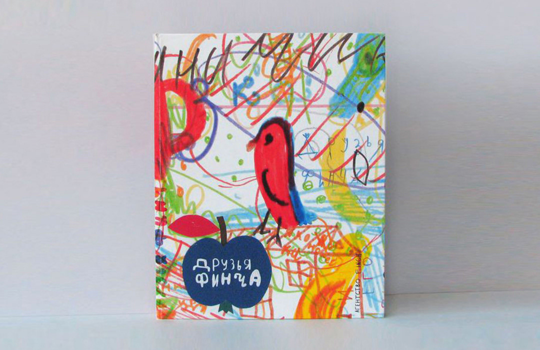
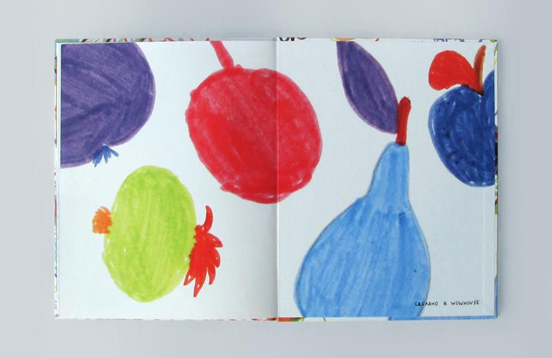
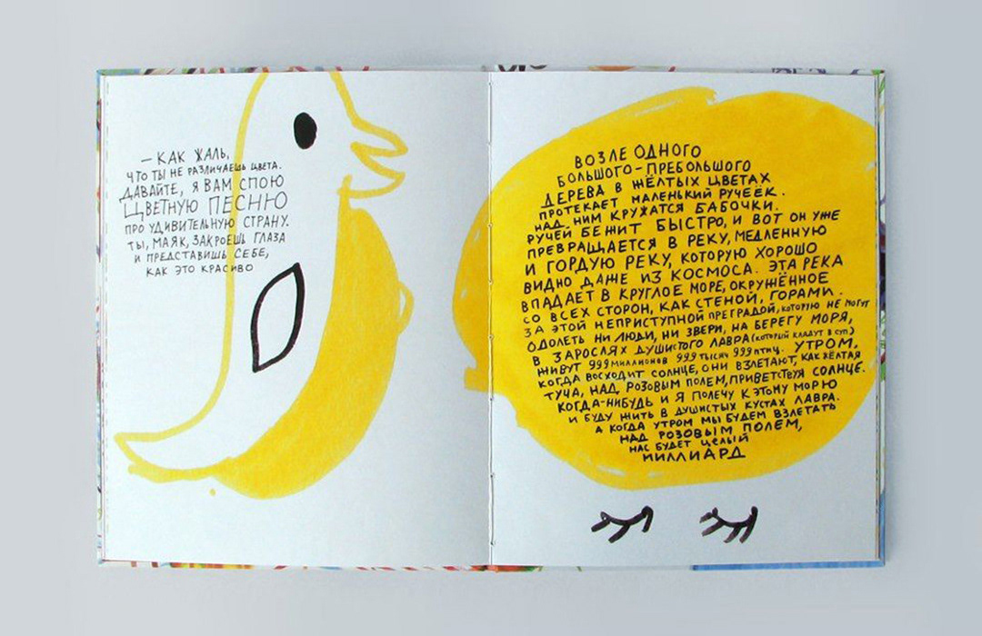
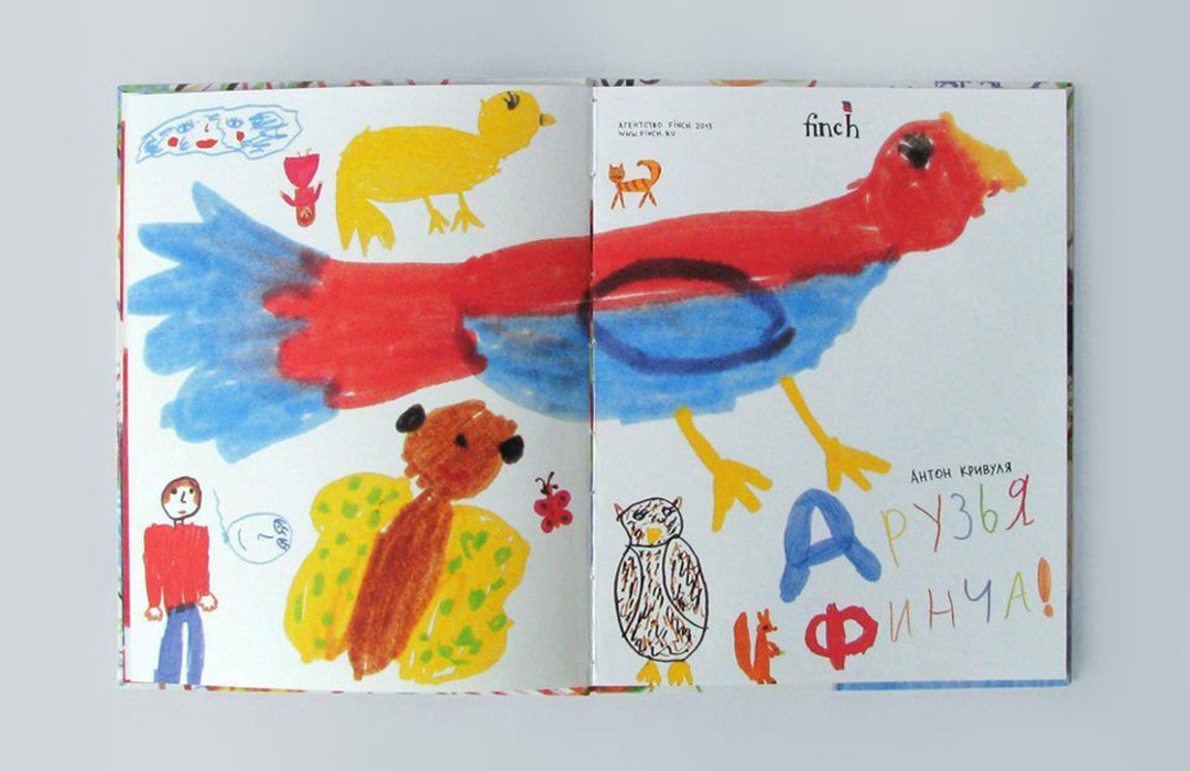
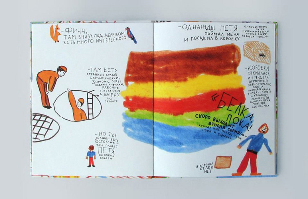
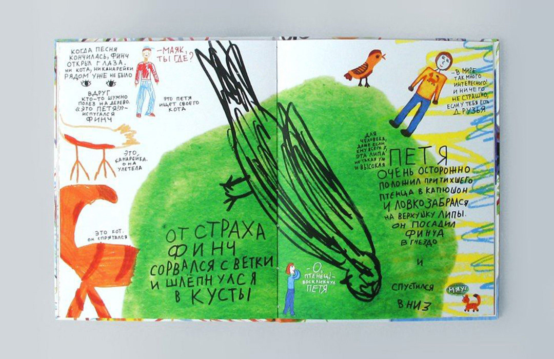
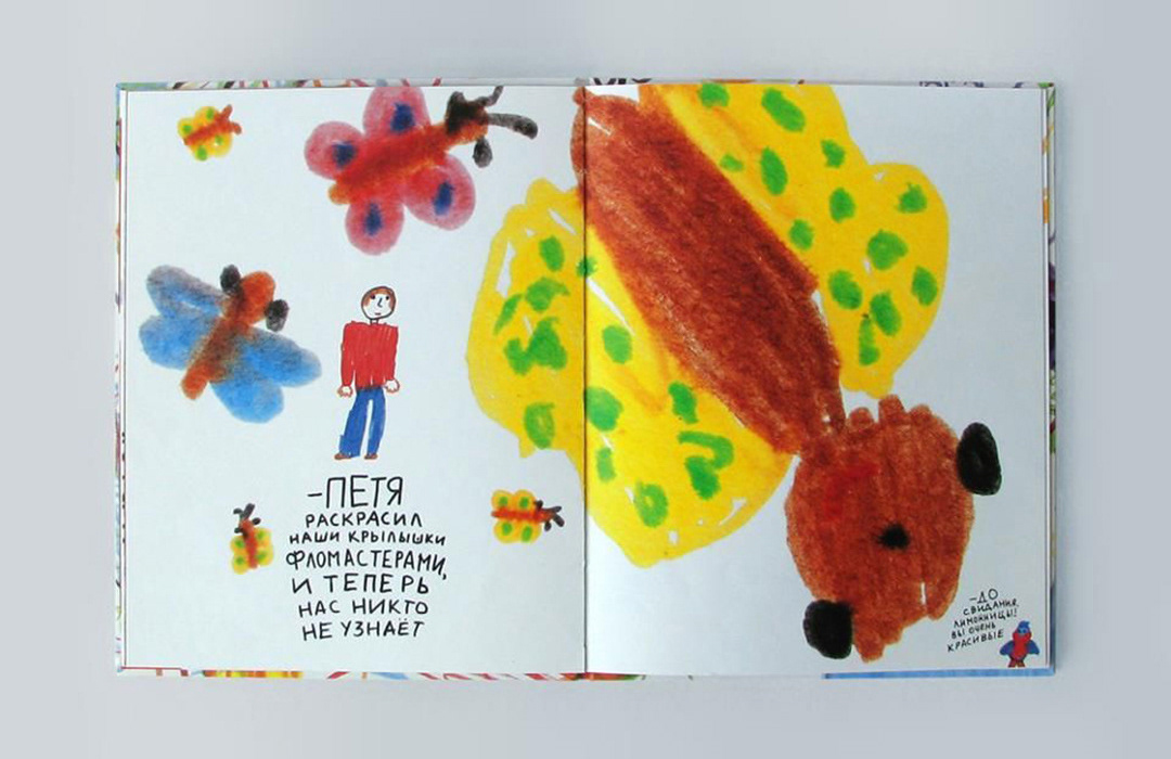
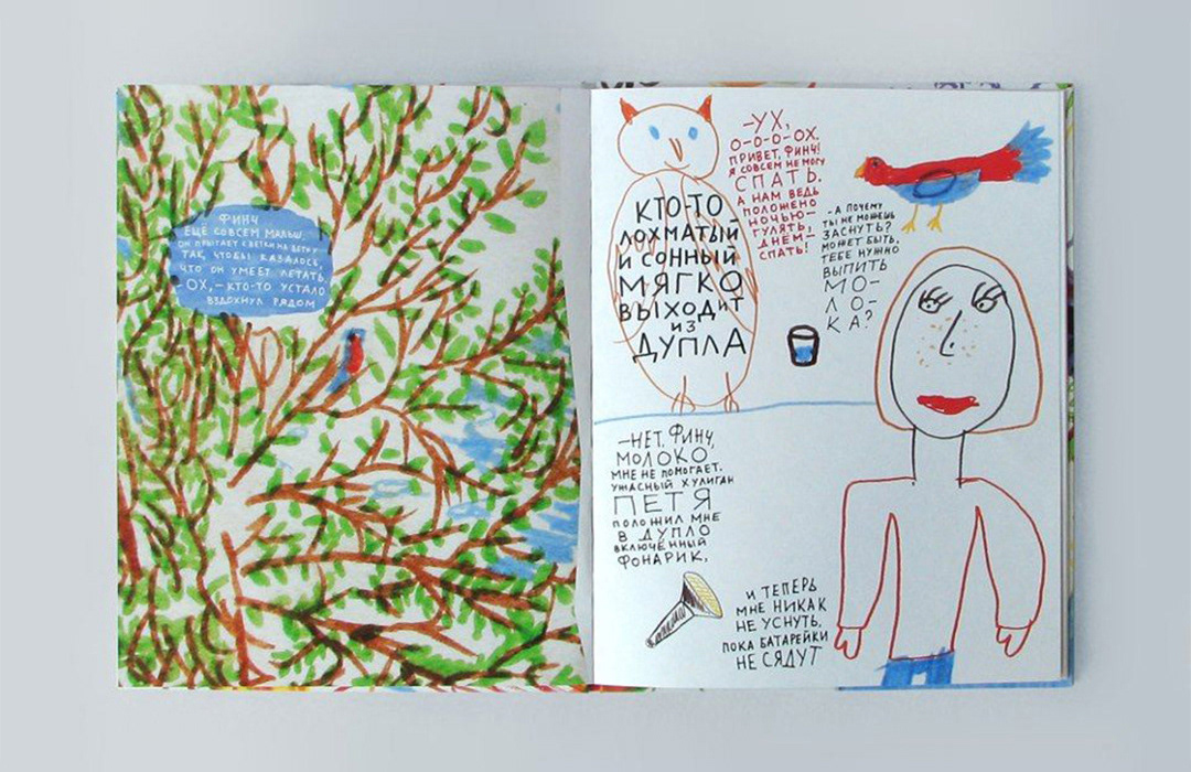
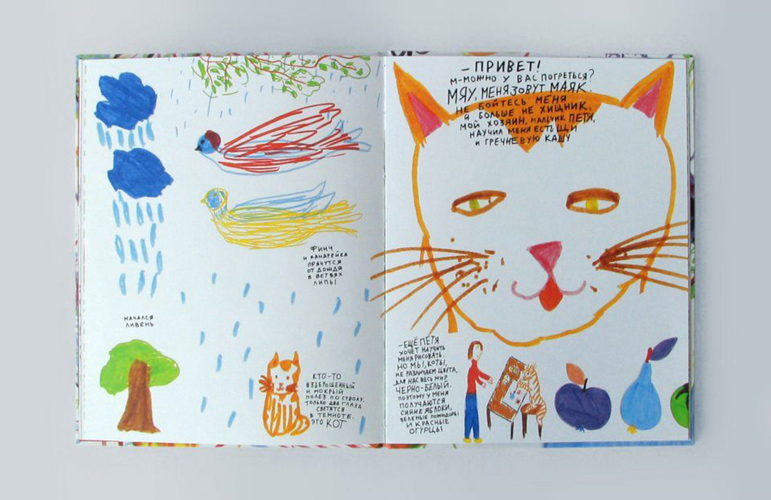
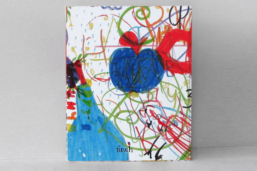
Finch Friends book extended the same logic into print. Produced with girls from the Kovcheg orphanage, Finch Agency, and Wowhouse, the book also worked as a charitable channel of client communication. Clients were invited to engage through support rather than through a conventional promotional message. A fairy tale was written for the project, and the drawings came from the children rather than from a corporate graphic language.
valie
Finch remained invisible to the market and legible to the right clients. Instead of a fixed identity, it developed a controlled mode of presence: private, selective, and tied to the name itself. The task was not to make the brand more visible. It was to let it appear without losing value.