role: design strategy, art direction
category: hospitality
year: 2018
category: hospitality
year: 2018

context
The challenge was to extract a massive restaurant chain from the «ethnic trap» — a territory of traditional hospitality that lacked relevance for a younger, progressive audience. The strategic task was to shift the brand into a new triad: Luxury. Smart. Fun. This required more than a visual update; it demanded a cultural rupture capable of generating «talk value» in a saturated urban environment.
conceptial move
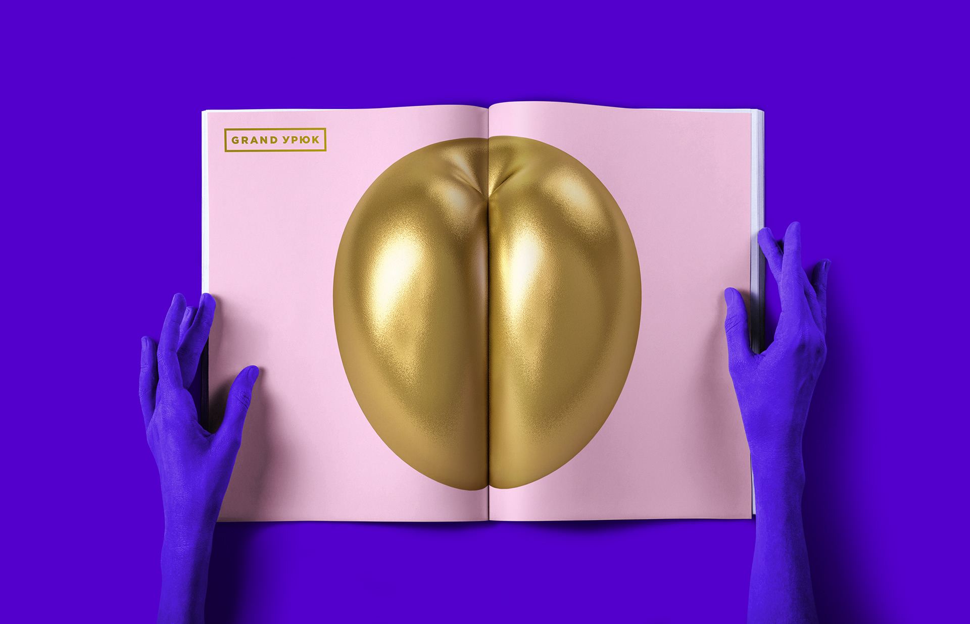
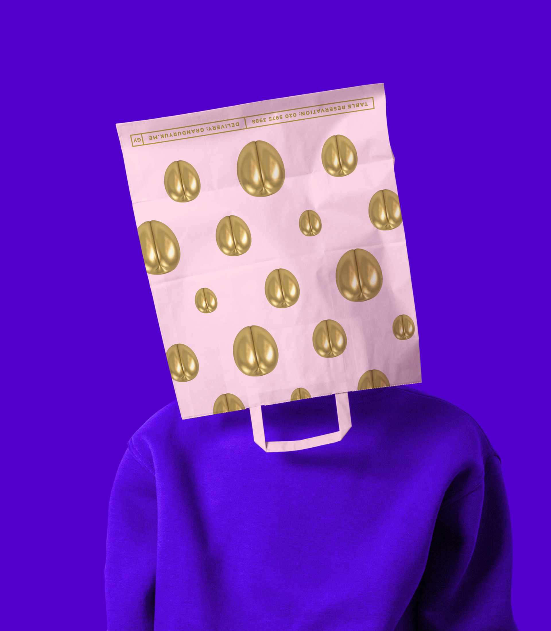
The core move was to treat the brand identity not as a service sign, but as a pop-art artifact. The central symbol — the golden apricot — was engineered with deliberate anatomical subtext. Its resemblance to human curves (the «backside») creates a subversive glitch in the context of food, triggering a disruptive effect.
By adopting the optics of contemporary art — specifically the mirror-polished, hyper-object aesthetics of Jeff Koons — we transformed a piece of fruit into a cult object. This wasn't design for a menu; it was the creation of a visual idol designed for the mechanics of social media algorithms and viral interpretation.


system logic
The system is built on the tension between provocation and precision. The «scandalous» object (the apricot) is placed within an obsessively disciplined framework. We utilized a rigorous, almost institutional grid and high-contrast typography to act as the «museum walls» for the provocation.
The identity oscillates between two states:
The Object: Bold, ambiguous, and dominant.
The Grid: Silent, technical, and stabilizing. This allows the brand to scale from a single sticker to massive interiors without losing its conceptual sharpness or operational stability.
The Grid: Silent, technical, and stabilizing. This allows the brand to scale from a single sticker to massive interiors without losing its conceptual sharpness or operational stability.


outcome
The rebrand successfully shifted the chain’s perception from a «place to eat ethnic food» to a pop-cultural destination. The golden apricot became a self-replicating cultural unit (a meme), ensuring high organic reach and instant recognizability.
The brand stopped competing with other restaurants and started competing with art galleries and lifestyle icons, proving that a premium brand can afford to be provocatively simple and intelligently bold, avoiding the risk of being «just another restaurant refresh» that fails to capture the attention of a post-digital audience.