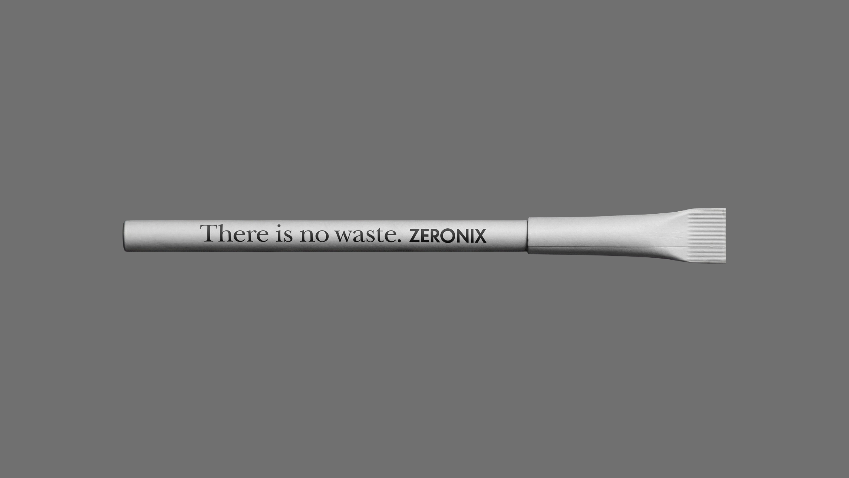
A radically minimal identity built around a single slogan, aligning the brand’s form with its ethics on waste.
Zeronix. The brand needs to generate own context.
A conceptual pivot from ethnic catering to pop-art phenomenon, utilizing anatomical ambiguity as a disruptive trigger for brand virality.
Grand Urük. The Market must accept the category shift.
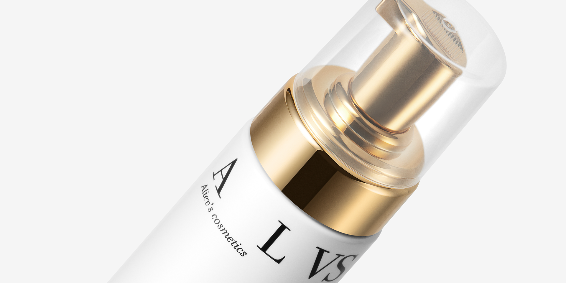
A premium skincare identity that turns a surgeon's surname into a coded mark, and excessive simplicity into an instrument of control.
ALVS. Luxury acts as a weapon.
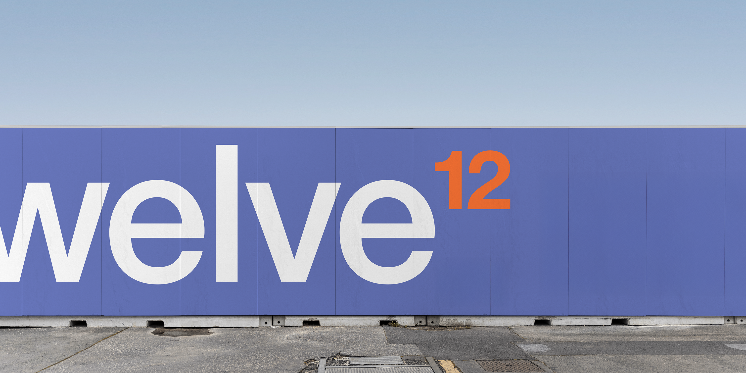
A high-performance identity system for residential real estate, engineered as a production machine for urban scale.
Twelve. The medium fights alignment.